 Orbit
OrbitTheming
Themes
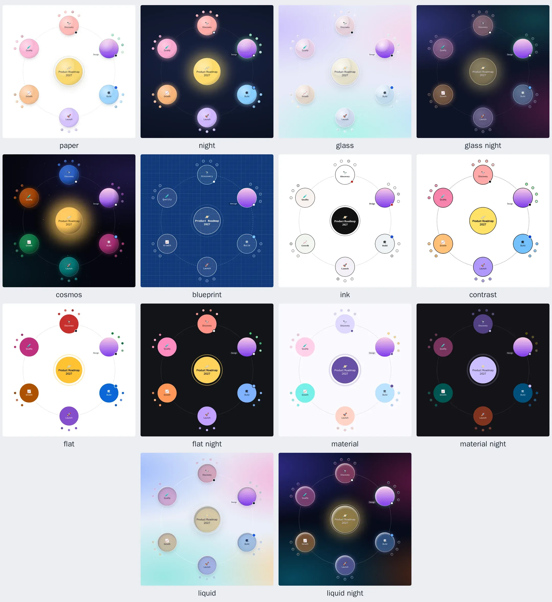
| Theme | Looks like | Background |
|---|---|---|
paper (default) |
Pastel planets with a soft colored shadow and a fine rim of their own color | Your page’s |
night |
Luminous planets that glow on a deep navy sky | Its own |
glass |
Frosted, translucent planets with a bright rim | Its own pastel backdrop |
glass-night |
Tinted glass planets that glow over an aurora | Its own |
cosmos |
Jewel-toned planets lit from one side, around a golden star with a corona | Deep space with stars |
blueprint |
Outlined planets, construction lines and monospaced labels | A gridded blue sheet |
ink |
Black line art: outlined planets, a black sun and serif lettering | Your page’s |
contrast |
Black outlines, solid colors and bold labels, for the most legible map | White |
flat |
Solid, saturated planets with white lettering: no shading, shadows or glow | Your page’s |
flat-night |
Bright solid planets with dark lettering, cut out from the page | Near black |
material |
Material 3: tonal containers around a sun in the primary color (see Material themes) | A tonal surface |
material-night |
Material 3’s dark scheme: deep containers with light lettering | A dark tonal surface |
liquid |
Liquid glass: clear planets that catch the light along their rims | A vivid wallpaper of its own |
liquid-night |
Liquid glass at night, glowing in each planet’s color | A deep, vivid wallpaper |
auto |
paper or night, following the reader’s light or dark preference |
Choose one with the theme option, the theme attribute of <orbit-map>, the theme prop in React, or theme: in a map’s frontmatter.
Your own themes get a name too: registerTheme('brand', { preset: 'night', tokens: { … } }) makes theme: brand work in all of those places (see Extending). The same guide covers status words with your own colors and node types with their own look.
Labels keep at least 4.5:1 contrast with their node in every theme (WCAG AA), on every branch color, every shade below it and whichever node is in focus; contrast keeps more than 7:1 (AAA).
Material themes from any color
materialTheme(color) builds a Material 3 theme from one color, the way Material You colors an app from its wallpaper: tonal palettes in the color’s hue, surfaces and containers chosen by tone, the sun in the primary color and each branch in its own hue, spread evenly around the color wheel from yours. Colors are chosen by tone, so labels and text stay readable whatever the color.
import { createOrbitMap, materialTheme, registerTheme } from '@restless-dreams/orbit';

createOrbitMap(element, markdown, { theme: materialTheme('#0B57D0') });

// Or name it, for `theme: brand` in frontmatter and <orbit-map theme="brand">:
registerTheme('brand', materialTheme('#E11D48', { dark: true }));
It takes any color Orbit reads (hex, rgb(), oklch()…) and returns a theme object built on material, or material-night with { dark: true }. The material themes themselves are built from Material’s baseline purple, MATERIAL_SEED.
Custom properties
Everything a theme sets is a CSS custom property. Set them on the map’s container, or anywhere above it, to restyle a map from your own stylesheet; they win over the theme:
.roadmap {
  --orbit-font-family: 'Inter', sans-serif;
  --orbit-color-root: #ffd166;
  --orbit-color-1: #ef476f;
  --orbit-color-2: #06d6a0;
  --orbit-color-3: #118ab2;
  --orbit-focus-ring: #ef476f;
}
For <orbit-map>, set them on the element (orbit-map { --orbit-surface: … }); they pass into its shadow root.
| Group | Properties |
|---|---|
| Fonts | --orbit-sans-font, --orbit-serif-font, --orbit-mono-font (the page’s font of each kind, which themes draw with: see Fonts), --orbit-font-family (the map’s own font, for its controls and sheet, and by default its labels) |
| Page | --orbit-surface (background color), --orbit-surface-pattern (CSS background layers drawn over it, or none), --orbit-text, --orbit-muted-text |
| Node colors | --orbit-color-root, --orbit-color-1 … --orbit-color-7 (one per top-level branch, in order), --orbit-shade-light and --orbit-shade-dark (what deeper nodes are mixed toward) |
| Planets | --orbit-node-fill-opacity, --orbit-moon-opacity, --orbit-node-highlight (the lit side), --orbit-node-terminator (where light turns to shadow), --orbit-node-shading (the far edge), --orbit-node-shade-circle (where the shading spreads, see below), --orbit-note-indicator |
| Rims | --orbit-node-stroke, --orbit-node-stroke-tint, --orbit-node-stroke-width (in pixels; in a crowded orbit, a planet’s rim is 4% of its radius per pixel, so it grows and shrinks with it), --orbit-badge-stroke (around status dots and content markers, which grow with their nodes) |
| Shadow or glow | --orbit-node-shadow, --orbit-node-shadow-tint, --orbit-node-shadow-opacity, --orbit-node-shadow-offset, --orbit-node-shadow-size, --orbit-sun-shadow-opacity, --orbit-sun-shadow-size |
| The sun’s halo | --orbit-sun-halo, --orbit-sun-halo-tint, --orbit-sun-halo-opacity, --orbit-sun-halo-width, --orbit-sun-halo-dash, --orbit-sun-halo-size |
| Orbits | --orbit-ring-stroke, --orbit-ring-tint, --orbit-ring-opacity, --orbit-ring-width, --orbit-ring-dash |
| Lines (overview) | --orbit-link-stroke, --orbit-link-tint, --orbit-link-opacity, --orbit-link-width, --orbit-link-dash |
| Labels | --orbit-label-font, --orbit-display-font (the node in focus and the detail sheet’s title), --orbit-label-weight, --orbit-display-weight, --orbit-label-letter-spacing, --orbit-root-text, --orbit-node-text, --orbit-node-text-inverse (on dark nodes), --orbit-label-shadow (behind light labels) |
| Focus | --orbit-focus-ring |
| Controls | --orbit-control-background, --orbit-control-border, --orbit-control-text, --orbit-control-muted-text, --orbit-control-active-background, --orbit-control-active-text, --orbit-control-shadow, --orbit-control-blur |
| Tooltip | --orbit-tooltip-background, --orbit-tooltip-text |
| Content buttons | --orbit-action-background, --orbit-action-border, --orbit-action-text, --orbit-action-shadow |
| Detail sheet and media viewer | --orbit-sheet-background (behind the viewer’s media too), --orbit-sheet-text, --orbit-sheet-muted-text, --orbit-sheet-border, --orbit-sheet-backdrop, --orbit-sheet-shadow (under the viewer’s videos too), --orbit-sheet-blur, --orbit-chip-background, --orbit-chip-text, --orbit-link-text. The viewer’s buttons are the controls’. |
| Status colors | --orbit-status-active, --orbit-status-done, --orbit-status-blocked, --orbit-status-todo, --orbit-status-neutral |
| Error card | --orbit-error-background, --orbit-error-border, --orbit-error-text |
The list is also exported as THEME_TOKENS, and themeTokens(name) returns a theme’s values, for example to style the rest of your page to match:
import { themeTokens } from '@restless-dreams/orbit';

const night = themeTokens('night');
document.body.style.background = night.surface;
Fonts
Maps draw with the reader’s system font, unless the page gives them its own. Themes use fonts by kind: most draw in a sans-serif, blueprint in a monospaced font and ink its names in a serif. Give the page’s font of each kind, and every theme draws with it in its own way:
orbit-map,
.my-map {
  --orbit-sans-font: 'Google Sans Flex', system-ui, sans-serif;  /* every sans-serif theme, and ink's controls */
  --orbit-serif-font: 'Source Serif 4', Georgia, serif;          /* ink's names */
  --orbit-mono-font: 'JetBrains Mono', ui-monospace, monospace;  /* blueprint */
}
--orbit-font-family sets one map’s font whatever its theme, and --orbit-label-font and --orbit-display-font only its names and the focused node’s.
Names are measured in the font they’re drawn in, so a name fills its node as far as it really reaches and never spills out of it, whatever the font, its weight or its letter spacing:
- Lines break at spaces, and inside long identifiers where they read, balanced so a name follows its node’s round shape (“Lanzamiento / en México” rather than “Lanzamiento en / México”).
- Narrower widths: with a font that has a width axis (Google Sans Flex, Roboto Flex, Roboto and others), a name that would otherwise be cut short is drawn semi-condensed or condensed when that shows it whole. Other fonts keep their width.
- Web fonts: names are fitted again when a font finishes loading, so a map drawn before its font arrives settles into it. The page doesn’t need to wait for its fonts before drawing a map.
- Exports break names where the map shows them. Without a browser to measure in (
renderToSVGStringon a server), widths are estimated from the kind of each character.
Shaping planets
Rims, shadows, the sun’s halo, orbits and lines take the color of the node they belong to, mixed with a color of the theme. The -tint properties say how much of the node’s color goes in: --orbit-node-stroke-tint: 78% draws the rim with 78% of the node’s color and 22% of --orbit-node-stroke; 100% is the node’s color alone and 0% the theme’s color alone.
Widths are in screen pixels; -offset and -size are in node radii, so --orbit-node-shadow-offset: 0.16 drops the shadow by about a sixth of the node’s radius. Dashes take a stroke-dasharray (4 4, or none for a solid line).
/* Flat planets with a dark outline and no shadow */
.roadmap {
  --orbit-node-highlight: transparent;
  --orbit-node-shading: transparent;
  --orbit-node-stroke: #1f2733;
  --orbit-node-stroke-tint: 0%;
  --orbit-node-stroke-width: 2;
  --orbit-node-shadow-opacity: 0;
  --orbit-sun-shadow-opacity: 0;
}

/* A glow in each planet's own color instead of a shadow */
.roadmap {
  --orbit-node-shadow-tint: 100%;
  --orbit-node-shadow-offset: 0;
  --orbit-node-shadow-size: 1.2;
  --orbit-node-shadow-opacity: 0.45;
}
The shading is one radial gradient over every node, from --orbit-node-highlight at its center through --orbit-node-terminator to --orbit-node-shading at its edge. --orbit-node-shade-circle places it: its center, then its radius, in fractions of the node’s box. The default, 0.34 0.3 0.78, lights spheres from the top left. A circle a little to the bottom right with bright outer colors makes glass instead, catching the light along the rim, as liquid does:
/* Clear glass, with light along the rim */
.roadmap {
  --orbit-node-fill-opacity: 0.25;
  --orbit-node-highlight: transparent;
  --orbit-node-terminator: rgba(16, 24, 60, 0.07);
  --orbit-node-shading: rgba(255, 255, 255, 0.95);
  --orbit-node-shade-circle: 0.53 0.55 0.56;
}
The circle is read when the theme is set, and is the same for every node of a map.
Colors in code
createOrbitMap(element, markdown, {
  theme: { preset: 'night', tokens: { surface: '#0b1020', 'font-family': 'Inter, sans-serif', 'ring-dash': 'none' } },
  palette: ['#ffd166', '#ef476f', '#06d6a0', '#118ab2'],
});themetakes a theme name or an object. The object’spresetpicks the theme to start from (without one, the document’s theme orpaper), andtokenssets any property by name, without the--orbit-prefix. Properties set in the page’s CSS still win.palettereplaces the node colors: the first for the root, then one per top-level branch, cycling when there are more branches than colors.- A node’s own
color(<!-- orbit color: #ef476f -->, orcolor:in YAML) always wins.
How nodes get their colors
Each top-level branch takes the next palette color, and everything under it uses shades of that color, mixed toward --orbit-shade-light or --orbit-shade-dark by position, so siblings stay distinguishable and a node keeps its color in every view. Labels use whichever of the theme’s dark and light text has more contrast with the node, custom colors included.
Dark mode
theme: 'auto'follows the reader’s system preference.- To follow your site’s own switch, set the theme when it changes:
renderer.setOptions({ theme: isDark ? 'night' : 'paper' }), or update thethemeattribute or prop. night,glass-night,cosmos,blueprint,flat-night,material-nightandliquid-nightare dark: they tell the browser so (color-scheme: dark), which darkens scrollbars and form controls in the detail sheet.- Themes that paint their own background can let your page show through instead: set
--orbit-surface: transparentand--orbit-surface-pattern: none.
Exports
renderToSVGString(markdown, { theme }) and orbit render --theme resolve every property to a plain color, so exported files look the same anywhere. In the browser, renderer.toSVGString() also picks up the custom properties your page sets. Background patterns are CSS, so exports keep the --orbit-surface color without them.